

UX + UI Design Project
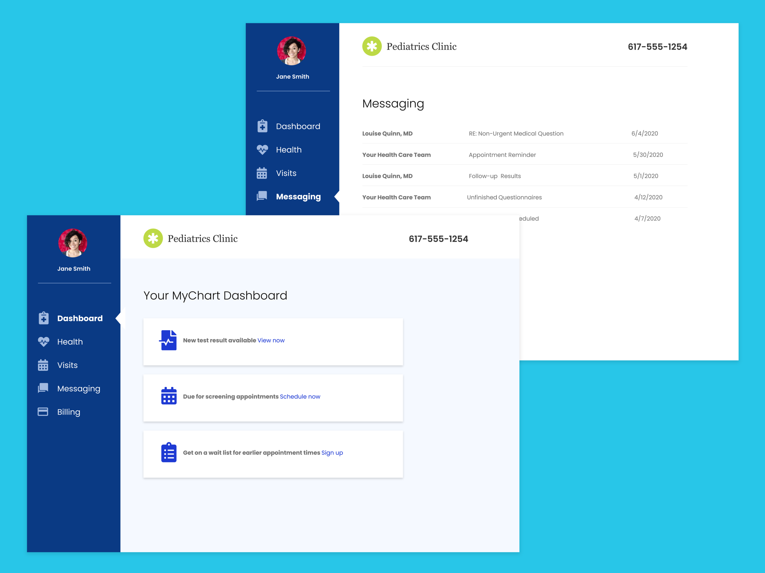
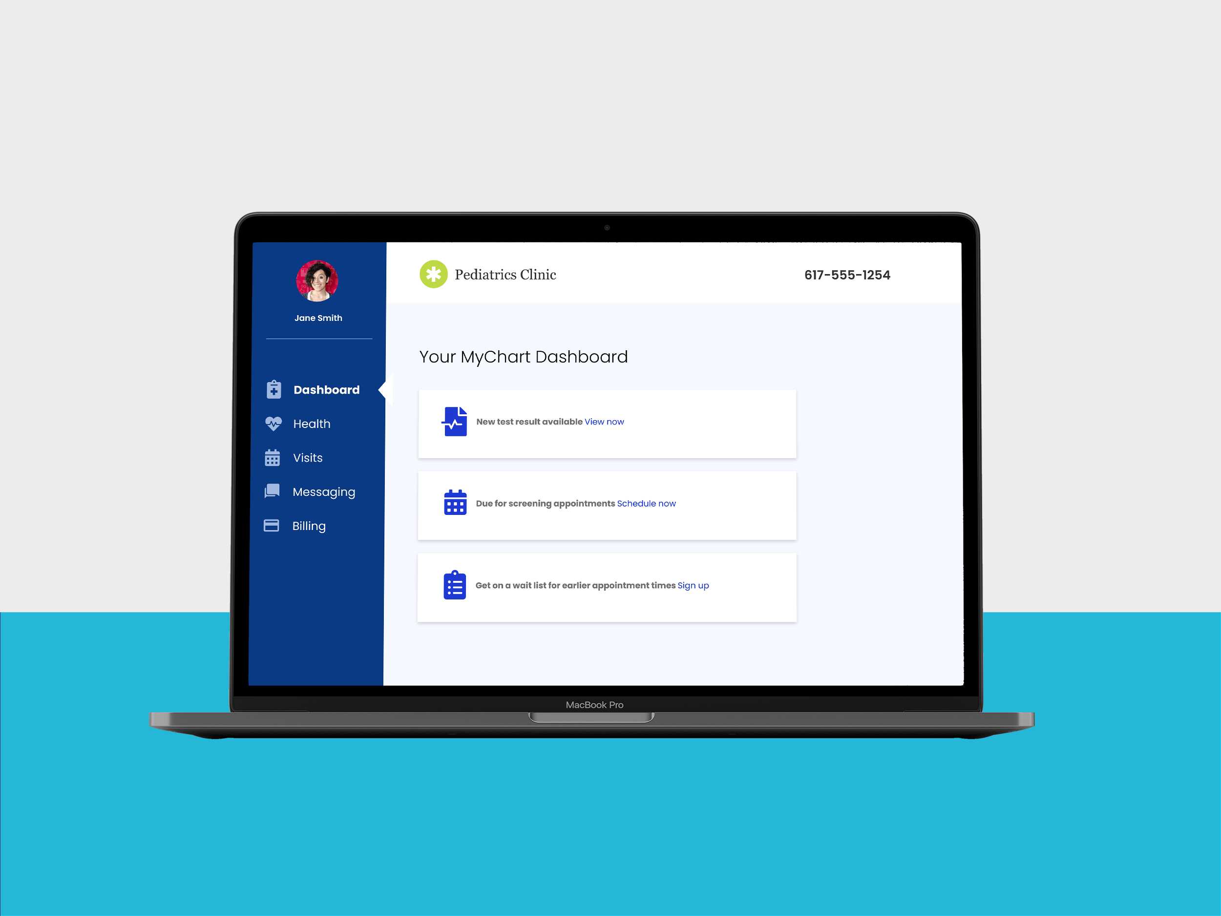
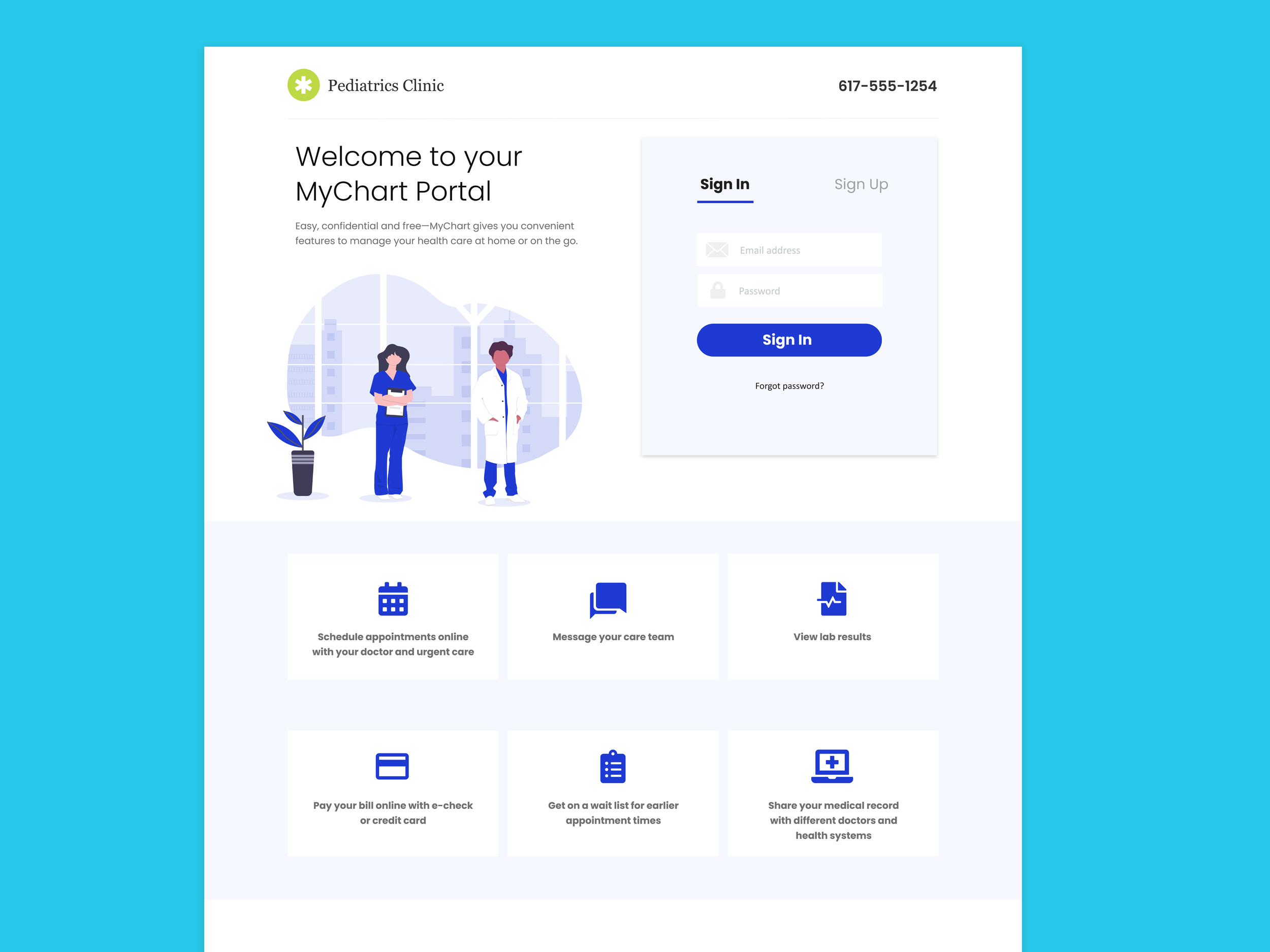
As a personal project, I wanted to work on redesigning the patient portal for MyChart. I have personally been frustrated by the user experience of it while trying to manage our health details.
PAIN POINTS:
-disorganized, hard to know where to look first
-confusing/too busy
-simple tasks such as retrieving a school or camp form are too many layers deep
SOLUTIONS:
Content structuring
Streamline the overall UX flow and ensure accessibility of all page elements so users feel confident while browsing portal.
White space increases content legibility by separating blocks of information, which adds up to a better overall user experience.
According to research by Human Factor International, good use of white space increases comprehension by almost 20%.
Navigation
Clunky portals can discourage patients from using it. The clear and simplified navigation system enables a patient to easily find what they are looking for to accomplish their task.
